Following Figma's major August 2026 Design Tokens update, engineering and product teams worldwide are rapidly migrating legacy pixel-based design systems to dynamic, relative REM units. As design systems standardize on flexible variable tokens, hardcoded CSS pixel values are officially becoming technical debt.
Building responsive web interfaces in 2026 requires seamless scaling across ultra-high-definition displays, foldable screens, and personalized browser text sizing. When developers receive raw pixel specifications from Figma prototypes, manual math slows down sprint velocity and introduces rounding errors across breakpoints.
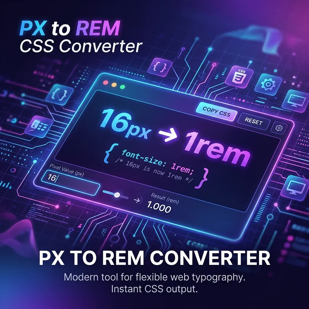
To transform pixel measurements into production-ready CSS instantly without installing heavy CLI tools or uploading private design assets to third-party cloud servers, our free browser utility PX to REM Converter runs entirely client-side—meaning your code and token values never leave your browser memory.
The August 2026 Design Token Shift: Why REM is Essential
In August 2026, W3C updated its digital accessibility benchmarks, placing renewed emphasis on user-controlled text scaling. Modern browsers allow vision-impaired users to adjust default root font sizes from the standard 16px to 20px, 24px, or higher. When stylesheets rely on static pixel values (`font-size: 18px; padding: 24px;`), browser font scaling settings are ignored, causing text truncation and layout breakage.
By contrast, REM (Root EM) units scale relative to the root element (``). A value of `1.25rem` dynamically adjusts based on the user's preferred root font size. With Figma's August 2026 token pipeline automatically mapping design variables to CSS custom properties, developers need an accurate, instant way to convert pixel tokens into REM units during implementation.
The Problem with Legacy PX Tools & Cloud Converters
Many legacy web converters require submitting design token sheets or CSS snippets to remote backend servers. In corporate enterprise environments, uploading proprietary UI tokens, unreleased product layouts, or brand specifications violates strict security compliance standards.
- Privacy & Compliance Risk: Sending internal design token datasets or code snippets over cloud servers exposes sensitive intellectual property.
- Workflow Overhead: Complex build-time post-CSS plugins require configuration maintenance, node module dependencies, and constant pipeline updates.
- Inflexible Root Sizes: Most online converters lock base font size to 16px, failing to support custom micro-frameworks or 10px root resetting strategies (`62.5% font-size`).
Key Advantages of Our Client-Side PX to REM Tool
- 🔒 100% Client-Side Privacy: All calculations execute locally inside your browser memory using WebAssembly and pure JavaScript. Zero server uploads, zero telemetry, zero data logging.
- ⚡ Instant Real-Time Conversion: Type any pixel value or paste multi-line Figma token specs to receive immediate REM conversions as you type.
- 🎛️ Customizable Base Font Size: Easily adjust root base font size from default 16px to 10px, 14px, or custom baseline values required by your framework.
- 🚀 Copy-Ready Output: One-click copy buttons for clean CSS output, Tailwind CSS arbitrary values, and design token format strings.
Step-by-Step Guide: Converting Figma Specs to CSS REM
- Open the PX to REM Converter in any modern browser on desktop or mobile.
- Set your project's base root font size (default is set to 16px, matching standard browser defaults).
- Enter the pixel value from your Figma Dev Mode panel or design specification sheet into the input field.
- Copy the calculated REM value instantly and paste it directly into your CSS, SCSS, or Tailwind stylesheet.
Pro Tips for Fluid Typography & Responsive Systems
When building modern responsive web apps in 2026, combine REM units with CSS fluid functions like `clamp()`. For example, setting `font-size: clamp(1rem, 2.5vw, 2rem);` creates smooth scaling between mobile viewports (`16px`) and desktop screens (`32px`).
Additionally, if your development team uses Tailwind CSS or CSS Custom Properties, using REM units ensures consistent vertical rhythm and spatial proportions when user zoom levels change.
Why Trust This Guide & Tool
At ni18, we build privacy-first developer utilities designed for modern web standards. Our tools operate on strict zero-data-collection principles. Every conversion is calculated locally in your browser DOM without network requests, cookies, or external analytics tracking.
Conclusion & Get Started
Mastering Figma design tokens in August 2026 requires shifting away from fixed pixel values. By converting your pixel specs to relative REM units, you ensure accessible, fluid UI scaling across all device viewports.
Launch PX to REM Converter Free →
Frequently Asked Questions
What is the difference between PX and REM units in CSS?
PX (pixel) is a static, absolute unit fixed to display pixel density. REM (root em) is a relative unit calculated from the html root element's font size (usually 16px), allowing layouts to scale smoothly with user accessibility preferences.
Is my design data kept private when using this converter?
Yes, 100%. All PX to REM calculations take place locally inside your web browser. No data, token specs, or design code is ever transmitted to external cloud servers.
How do I convert 24px to REM using a standard 16px base font size?
To convert 24px to REM with a 16px base, divide 24 by 16, which equals 1.5rem. You can enter 24 in our online converter to instantly calculate this value.
Why did Figma update design token standards in August 2026?
Figma updated design tokens to improve multi-brand design systems, fluid typography scaling, and automatic export compatibility with modern web frameworks that prioritize relative units over static pixels.
Does this PX to REM tool support custom base font sizes like 10px?
Yes! You can adjust the root base font size field to any custom value (such as 10px or 14px) and the tool will instantly recalculate all values accordingly.