In August 2026, the World Wide Web Consortium (W3C) and major browser engine maintainers issued updated enforcement guidance for responsive typography and WCAG 2.2 accessibility compliance. Web audits and automated accessibility scoring engines now strictly penalize web applications relying on hardcoded pixel (`px`) font sizes and fixed layout dimensions.
When users customize their default browser font settings or utilize assistive zoom, pixel-bound elements refuse to scale proportionally. This creates severe text truncation, broken container flexbox layouts, and unreadable UI components. To align modern web applications with fluid design principles, developers are actively migrating legacy CSS stylesheets from absolute pixels to root-relative `rem` units.
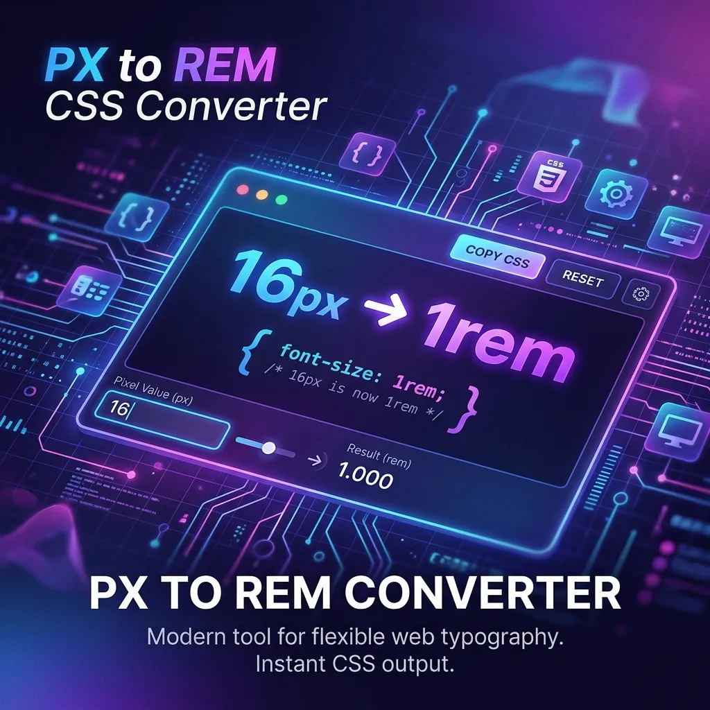
To perform this migration effortlessly without installing heavy build tooling or sending proprietary codebases to third-party servers, our free browser utility PX to REM Converter processes all conversions 100% client-side—ensuring your source code and design tokens never leave your browser memory.
Why W3C 2026 Guidelines Demand REM Typography
Modern display technologies in August 2026 span everything from foldable mobile devices to ultra-wide 8K desktop displays. Hardcoding typography in pixels assumes every device shares identical display density and user visual preferences. The W3C Web Content Accessibility Guidelines (WCAG) 2.2 emphasize that text must scale smoothly up to 200% without loss of content or functionality.
Root-relative units (`rem`) dynamically calculate output font sizes based on the user's root element font configuration (typically defaulting to `16px`). When a user adjusts their system font scale for accessibility, every `rem`-based element scales fluidly across the entire application hierarchy.
The Danger of Cloud-Based Conversion Tools
Many online conversion utilities require pasting full CSS stylesheets or design system token files directly into server-side inputs. This introduces substantial privacy and security vulnerabilities:
- Data Leakage Risk: Proprietary class names, component structures, and internal brand variable tokens are transmitted across external networks.
- Server Dependency & Latency: Remote API calls introduce artificial delay, network failures, and mandatory registration paywalls.
- Unwanted Telemetry: Third-party tracking scripts log developer input payloads and commercial workflow details.
Key Advantages of Our PX to REM Converter
- 🔒 100% Client-Side Privacy: All math and parsing logic execute locally within browser JavaScript. Zero server uploads, zero logs, and complete data isolation.
- ⚡ Instant Real-Time Calculations: Immediate bi-directional conversion between `px` and `rem` as you type or adjust base font sizing.
- 🚀 Flexible Base Unit Adjustments: Easily configure custom base pixel sizes (e.g., `16px`, `10px`, or `14px`) to match your framework's baseline reset.
- 🌐 Offline Ready & Cross-Browser Compatible: Functions seamlessly on Chrome, Firefox, Safari, and Edge without active internet requirements once loaded.
Step-by-Step Conversion Workflow Guide
- Open the PX to REM Converter in your browser.
- Set your root base font size (default is set to standard 16px).
- Input your pixel (`px`) value into the conversion box to generate the exact relative `rem` unit.
- Copy the converted CSS output snippet directly into your stylesheet or design system config.
Pro Tips for Modern Responsive Typography
When refactoring legacy design systems in August 2026, combine `rem` units for font sizing and padding with CSS `clamp()` functions for fluid typography transitions. For example, setting `font-size: clamp(1rem, 2.5vw, 2rem);` guarantees accessible minimum text boundaries while scaling harmoniously across viewports.
Conclusion & Get Started
Upgrading your CSS codebase to `rem` units ensures compliance with W3C WCAG 2.2 accessibility standards and guarantees a resilient, responsive visual experience for all users.
Launch PX to REM Converter Free →
Frequently Asked Questions
Why are W3C standards penalizing fixed pixel font sizes in 2026?
Fixed pixels override user browser font preferences, preventing text from zooming for visually impaired users and violating WCAG 2.2 accessibility guidelines.
Is my source code uploaded to any external server during conversion?
No. All calculations run 100% client-side in your browser memory. No data is stored or transmitted externally.
What is the standard base font size for converting PX to REM?
The default browser root font size is 16px, meaning 1rem equals 16px unless custom root styling is applied.
Should I use REM units for layout margins and padding as well?
Yes, using REM for spacing ensures that padding and margins scale proportionally with typography when users zoom text.
Can I convert REM back to PX using this tool?
Yes, our utility provides bi-directional conversion between pixel values and REM units instantly.